Applied Machine Learning - Observing Data
This is the first entry in a series where I will be using R to replicate a graduate-level applied machine learning course that is purely in Python.
The goal of the first class period was to introduce some of the data manipulation packages in Python to students. As such, most of the code here will be pretty simple to replicate since data manipulation is the bread-and-butter of R. However, there is a bit of interactivity in the final section that I am looking forward to work on. All of the code chunks are included so feel free to take your time and understand what each piece is doing.
Preparing Data
For this lab, we used two datasets from the UCI Data Repository:
Forest Fires Data
Auto MPG Data
First we need to load in the packages we’re going to use. In Python we used Numpy and Pandas for data handling, and Matplotlib for visuzalization. The R equivalents are tidyr, dplyr, and ggplot2, though getting familiar with more of the tidyverse library doesn’t hurt. gridExtra will let us arrange multiple grids on one page.
library(tidyverse)
## -- Attaching packages --------------------------------------- tidyverse 1.3.1 --
## v ggplot2 3.3.5     v purrr   0.3.4
## v tibble  3.1.6     v dplyr   1.0.8
## v tidyr   1.2.0     v stringr 1.4.0
## v readr   2.1.2     v forcats 0.5.1
## -- Conflicts ------------------------------------------ tidyverse_conflicts() --
## x dplyr::filter() masks stats::filter()
## x dplyr::lag()    masks stats::lag()
library(readr)
library(gridExtra)
##
## Attaching package: 'gridExtra'
## The following object is masked from 'package:dplyr':
##
##     combine
library(grid)
library(shiny)
After downloading the data and placing it in your current working directory, you can load it like so:
ff_data <- read_csv('forestfires.csv', show_col_types = F)
ff_data # Let's take a look at what we've loaded.
## # A tibble: 517 x 13
##        X     Y month day    FFMC   DMC    DC   ISI  temp    RH  wind  rain  area
##    <dbl> <dbl> <chr> <chr> <dbl> <dbl> <dbl> <dbl> <dbl> <dbl> <dbl> <dbl> <dbl>
##  1     7     5 mar   fri    86.2  26.2  94.3   5.1   8.2    51   6.7   0       0
##  2     7     4 oct   tue    90.6  35.4 669.    6.7  18      33   0.9   0       0
##  3     7     4 oct   sat    90.6  43.7 687.    6.7  14.6    33   1.3   0       0
##  4     8     6 mar   fri    91.7  33.3  77.5   9     8.3    97   4     0.2     0
##  5     8     6 mar   sun    89.3  51.3 102.    9.6  11.4    99   1.8   0       0
##  6     8     6 aug   sun    92.3  85.3 488    14.7  22.2    29   5.4   0       0
##  7     8     6 aug   mon    92.3  88.9 496.    8.5  24.1    27   3.1   0       0
##  8     8     6 aug   mon    91.5 145.  608.   10.7   8      86   2.2   0       0
##  9     8     6 sep   tue    91   130.  693.    7    13.1    63   5.4   0       0
## 10     7     5 sep   sat    92.5  88   699.    7.1  22.8    40   4     0       0
## # ... with 507 more rows
In Python, we completed this first task using ‘np.loadtxt()’ which created an intentional error that required students to convert the month and day columns to numeric values. For the sake of being thorough, one way (of many) to do this is in the chunk below.
I’ll be demonstrating only the last 20 observations when printing dataframes only due to the length of the data.
ff_data_num <- as.data.frame(ff_data %>%
  mutate(month = case_when(month =='jan' ~ 1,
                           month =='feb' ~ 2,
                           month =='mar' ~ 3,
                           month =='apr' ~ 4,
                           month =='may' ~ 5,
                           month =='jun' ~ 6,
                           month =='jul' ~ 7,
                           month =='aug' ~ 8,
                           month =='sep' ~ 9,
                           month =='oct' ~ 10,
                           month =='nov' ~ 11,
                           month =='dec' ~ 12),
         day = case_when(day =='mon' ~ 1,
                         day =='tue' ~ 2,
                         day =='wed' ~ 3,
                         day =='thu' ~ 4,
                         day =='fri' ~ 5,
                         day =='sat' ~ 6,
                         day =='sun' ~ 7)))
tail(ff_data_num, 20) # Once again, let's see what we did.
##     X Y month day FFMC   DMC    DC  ISI temp RH wind rain  area
## 498 3 4     8   2 96.1 181.1 671.2 14.3 32.3 27  2.2  0.0 14.68
## 499 6 5     8   2 96.1 181.1 671.2 14.3 33.3 26  2.7  0.0 40.54
## 500 7 5     8   2 96.1 181.1 671.2 14.3 27.3 63  4.9  6.4 10.82
## 501 8 6     8   2 96.1 181.1 671.2 14.3 21.6 65  4.9  0.8  0.00
## 502 7 5     8   2 96.1 181.1 671.2 14.3 21.6 65  4.9  0.8  0.00
## 503 4 4     8   2 96.1 181.1 671.2 14.3 20.7 69  4.9  0.4  0.00
## 504 2 4     8   3 94.5 139.4 689.1 20.0 29.2 30  4.9  0.0  1.95
## 505 4 3     8   3 94.5 139.4 689.1 20.0 28.9 29  4.9  0.0 49.59
## 506 1 2     8   4 91.0 163.2 744.4 10.1 26.7 35  1.8  0.0  5.80
## 507 1 2     8   5 91.0 166.9 752.6  7.1 18.5 73  8.5  0.0  0.00
## 508 2 4     8   5 91.0 166.9 752.6  7.1 25.9 41  3.6  0.0  0.00
## 509 1 2     8   5 91.0 166.9 752.6  7.1 25.9 41  3.6  0.0  0.00
## 510 5 4     8   5 91.0 166.9 752.6  7.1 21.1 71  7.6  1.4  2.17
## 511 6 5     8   5 91.0 166.9 752.6  7.1 18.2 62  5.4  0.0  0.43
## 512 8 6     8   7 81.6  56.7 665.6  1.9 27.8 35  2.7  0.0  0.00
## 513 4 3     8   7 81.6  56.7 665.6  1.9 27.8 32  2.7  0.0  6.44
## 514 2 4     8   7 81.6  56.7 665.6  1.9 21.9 71  5.8  0.0 54.29
## 515 7 4     8   7 81.6  56.7 665.6  1.9 21.2 70  6.7  0.0 11.16
## 516 1 4     8   6 94.4 146.0 614.7 11.3 25.6 42  4.0  0.0  0.00
## 517 6 3    11   2 79.5   3.0 106.7  1.1 11.8 31  4.5  0.0  0.00
The case_when function takes a logical statement and performs an action in cases where the result is TRUE. In that way it’s very similar to if-else functions though I prefer case_when in these situations.
Next we’ll use a few functions to learn some details about our data.
head(ff_data_num, 5) # returns first 5 rows
##   X Y month day FFMC  DMC    DC ISI temp RH wind rain area
## 1 7 5     3   5 86.2 26.2  94.3 5.1  8.2 51  6.7  0.0    0
## 2 7 4    10   2 90.6 35.4 669.1 6.7 18.0 33  0.9  0.0    0
## 3 7 4    10   6 90.6 43.7 686.9 6.7 14.6 33  1.3  0.0    0
## 4 8 6     3   5 91.7 33.3  77.5 9.0  8.3 97  4.0  0.2    0
## 5 8 6     3   7 89.3 51.3 102.2 9.6 11.4 99  1.8  0.0    0
colnames(ff_data_num) # returns the column names
##  [1] "X"     "Y"     "month" "day"   "FFMC"  "DMC"   "DC"    "ISI"   "temp"
## [10] "RH"    "wind"  "rain"  "area"
dim(ff_data_num) # returns the number of rows and columns in the data
## [1] 517 13
length(which(is.na(ff_data_num))) # returns number of NA values in the data
## [1] 0
Splicing and indexing dataframes is a useful way to access pieces of your data. This can be done within and outside of tidyverse relatively easily.
tail(ff_data_num['area'], 20)
##      area
## 498 14.68
## 499 40.54
## 500 10.82
## 501  0.00
## 502  0.00
## 503  0.00
## 504  1.95
## 505 49.59
## 506  5.80
## 507  0.00
## 508  0.00
## 509  0.00
## 510  2.17
## 511  0.43
## 512  0.00
## 513  6.44
## 514 54.29
## 515 11.16
## 516  0.00
## 517  0.00
# these indexing methods following the dataframe name produce the same output:
# [,'area'], [,13], [, -1:-12]

tail(ff_data_num %>%
  select(area), 20)
##      area
## 498 14.68
## 499 40.54
## 500 10.82
## 501  0.00
## 502  0.00
## 503  0.00
## 504  1.95
## 505 49.59
## 506  5.80
## 507  0.00
## 508  0.00
## 509  0.00
## 510  2.17
## 511  0.43
## 512  0.00
## 513  6.44
## 514 54.29
## 515 11.16
## 516  0.00
## 517  0.00
Unlike pandas.describe(), the summary function used in R doesn’t include the count or standard deviation for numeric columns.
summary(ff_data_num)
##        X               Y           month             day             FFMC
##  Min.   :1.000   Min.   :2.0   Min.   : 1.000   Min.   :1.000   Min.   :18.70
##  1st Qu.:3.000   1st Qu.:4.0   1st Qu.: 7.000   1st Qu.:2.000   1st Qu.:90.20
##  Median :4.000   Median :4.0   Median : 8.000   Median :5.000   Median :91.60
##  Mean   :4.669   Mean   :4.3   Mean   : 7.476   Mean   :4.259   Mean   :90.64
##  3rd Qu.:7.000   3rd Qu.:5.0   3rd Qu.: 9.000   3rd Qu.:6.000   3rd Qu.:92.90
##  Max.   :9.000   Max.   :9.0   Max.   :12.000   Max.   :7.000   Max.   :96.20
##       DMC              DC             ISI              temp
##  Min.   :  1.1   Min.   :  7.9   Min.   : 0.000   Min.   : 2.20
##  1st Qu.: 68.6   1st Qu.:437.7   1st Qu.: 6.500   1st Qu.:15.50
##  Median :108.3   Median :664.2   Median : 8.400   Median :19.30
##  Mean   :110.9   Mean   :547.9   Mean   : 9.022   Mean   :18.89
##  3rd Qu.:142.4   3rd Qu.:713.9   3rd Qu.:10.800   3rd Qu.:22.80
##  Max.   :291.3   Max.   :860.6   Max.   :56.100   Max.   :33.30
##        RH              wind            rain              area
##  Min.   : 15.00   Min.   :0.400   Min.   :0.00000   Min.   :   0.00
##  1st Qu.: 33.00   1st Qu.:2.700   1st Qu.:0.00000   1st Qu.:   0.00
##  Median : 42.00   Median :4.000   Median :0.00000   Median :   0.52
##  Mean   : 44.29   Mean   :4.018   Mean   :0.02166   Mean   :  12.85
##  3rd Qu.: 53.00   3rd Qu.:4.900   3rd Qu.:0.00000   3rd Qu.:   6.57
##  Max.   :100.00   Max.   :9.400   Max.   :6.40000   Max.   :1090.84
Visualizing Data
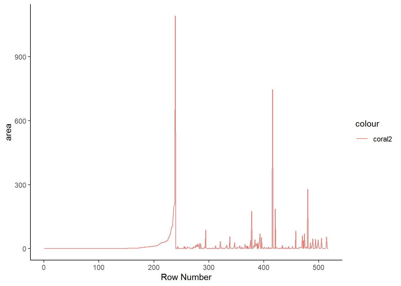
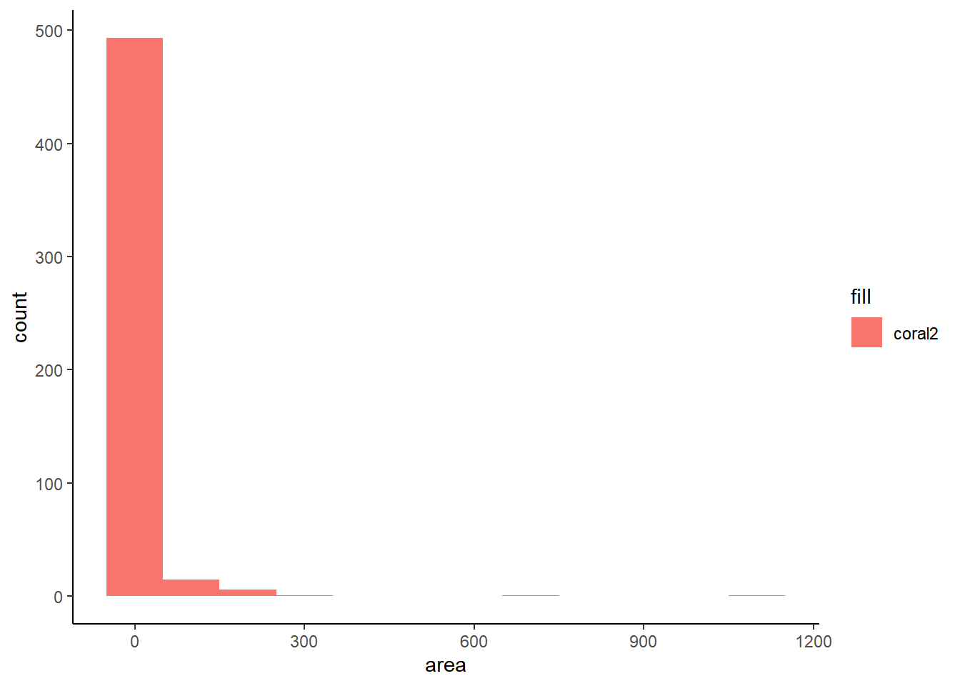
The grammar of graphics package known as ggplot2 is the primary graphical visualization package in R. We’ll flex its muscles just a bit to demonstrate a simple line chart and histogram. Notice there are a large number of forest fires with an area of 0. This is the reason I’ve opted to display the last twenty observations instead of the first twenty. This is also something to keep in mind for the Shiny app at the end.
ggplot(ff_data_num) +
  geom_line(aes(1:length(ff_data_num$area), area, color = 'coral2')) +
  labs(x= 'Row Number') +
  theme_classic()
ggplot(ff_data_num, mapping = aes(area, fill = 'coral2')) +
  geom_histogram(binwidth = 100) +
  theme_classic()
Putting it all together
Splitting data into features and targets
In later posts, we’ll want to predict a given feature which we refer to as our target. The remaining features will act as our input data to predict the target. Thus it can be useful to split our input features and target into two different variables.
t <- ff_data_num %>% select(area)
head(t)
##   area
## 1    0
## 2    0
## 3    0
## 4    0
## 5    0
## 6    0
X <- ff_data_num %>% select(-area)
head(X)
##   X Y month day FFMC  DMC    DC  ISI temp RH wind rain
## 1 7 5     3   5 86.2 26.2  94.3  5.1  8.2 51  6.7  0.0
## 2 7 4    10   2 90.6 35.4 669.1  6.7 18.0 33  0.9  0.0
## 3 7 4    10   6 90.6 43.7 686.9  6.7 14.6 33  1.3  0.0
## 4 8 6     3   5 91.7 33.3  77.5  9.0  8.3 97  4.0  0.2
## 5 8 6     3   7 89.3 51.3 102.2  9.6 11.4 99  1.8  0.0
## 6 8 6     8   7 92.3 85.3 488.0 14.7 22.2 29  5.4  0.0
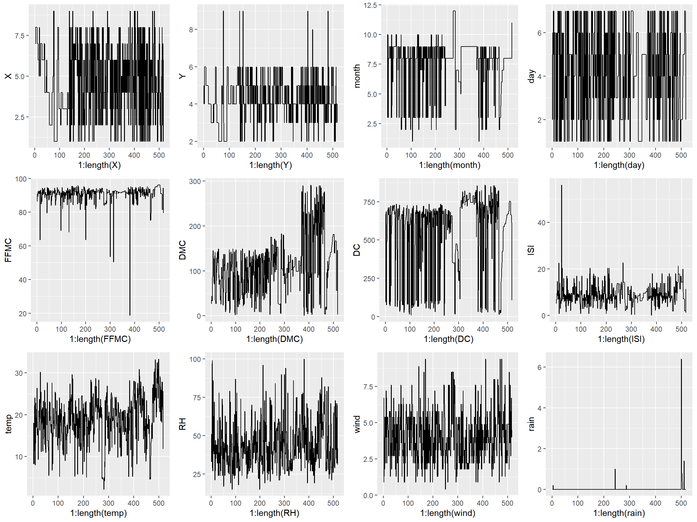
Generating subplots in R is just a bit clunkier than it is in Python as you need to enter each plot as a graphical object into grid.arrange. Because of that, I made each graph individually rather than in a loop.
p1 <- qplot(1:length(X), X, data = X, geom = "line")
p2 <- qplot(1:length(Y), Y, data = X, geom = "line")
p3 <- qplot(1:length(month), month, data = X, geom = "line")
p4 <- qplot(1:length(day), day, data = X, geom = "line")
p5 <- qplot(1:length(FFMC), FFMC, data = X, geom = "line")
p6 <- qplot(1:length(DMC), DMC, data = X, geom = "line")
p7 <- qplot(1:length(DC), DC, data = X, geom = "line")
p8 <- qplot(1:length(ISI), ISI, data = X, geom = "line")
p9 <- qplot(1:length(temp), temp, data = X, geom = "line")
p10 <- qplot(1:length(RH), RH, data = X, geom = "line")
p11 <- qplot(1:length(wind), wind, data = X, geom = "line")
p12 <- qplot(1:length(rain), rain, data = X, geom = "line")

grid.arrange(p1, p2, p3, p4, p5, p6, p7, p8, p9, p10, p11, p12, nrow=3, ncol=4)
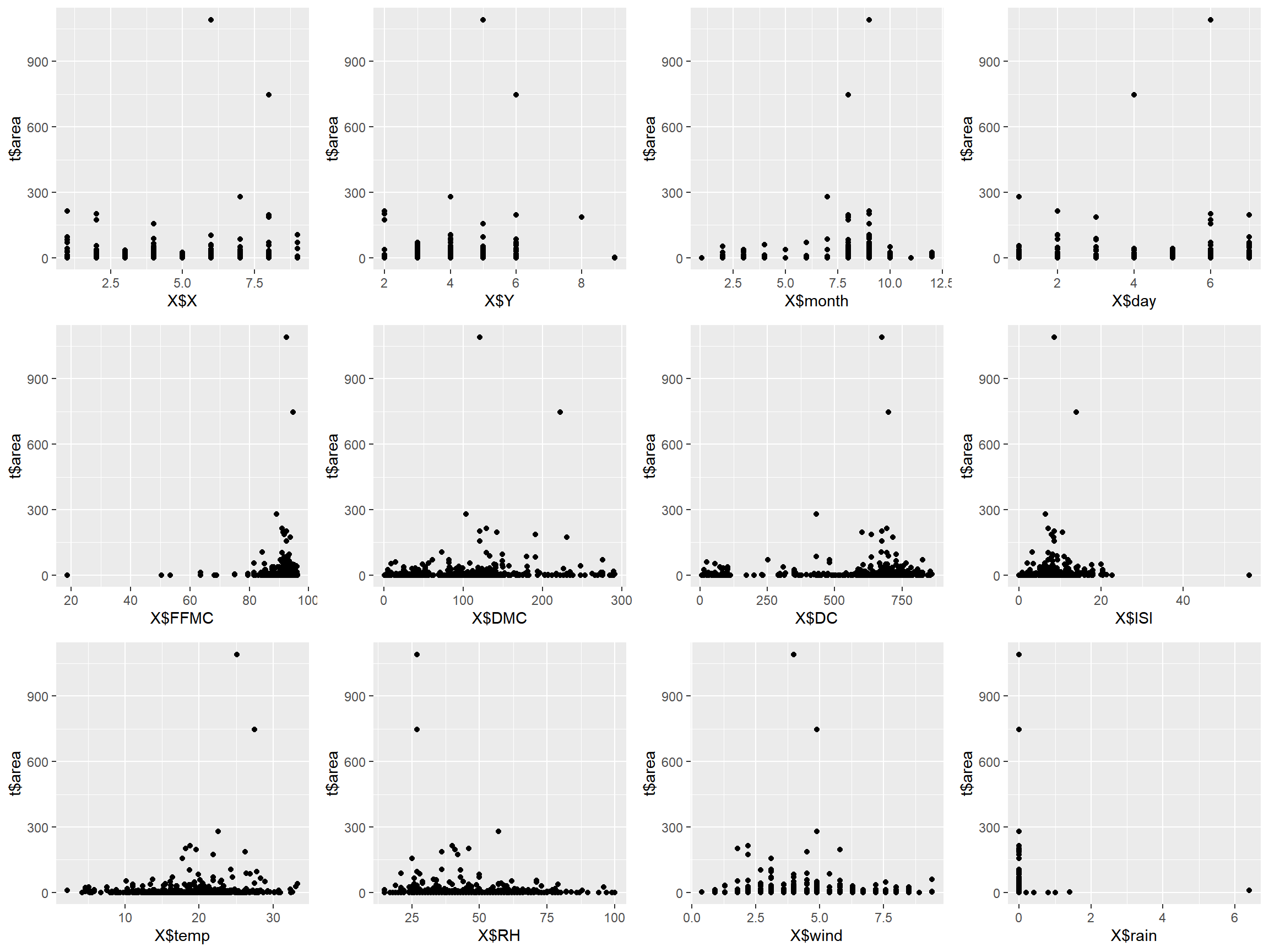
Plotting the data with lines doesn’t always make sense, so creating a scatterplot will often time make it easier to identify relationships between variables.
p1 <- qplot(x = X$X, y = t$area, geom = "point")
p2 <- qplot(x = X$Y, y = t$area, geom = "point")
p3 <- qplot(x = X$month, y = t$area, geom = "point")
p4 <- qplot(x = X$day, y =  t$area, geom = "point")
p5 <- qplot(x = X$FFMC, y =  t$area, geom = "point")
p6 <- qplot(x = X$DMC,  y =  t$area, geom = "point")
p7 <- qplot(x = X$DC, y =  t$area, geom = "point")
p8 <- qplot(x = X$ISI, y =  t$area, geom = "point")
p9 <- qplot(x = X$temp, y =  t$area, geom = "point")
p10 <- qplot(x = X$RH, y =  t$area, geom = "point")
p11 <- qplot(x = X$wind, y =  t$area, geom = "point")
p12 <- qplot(x = X$rain, y =  t$area, geom = "point")

grid.arrange(p1, p2, p3, p4, p5, p6, p7, p8, p9, p10, p11, p12, nrow=3, ncol=4)
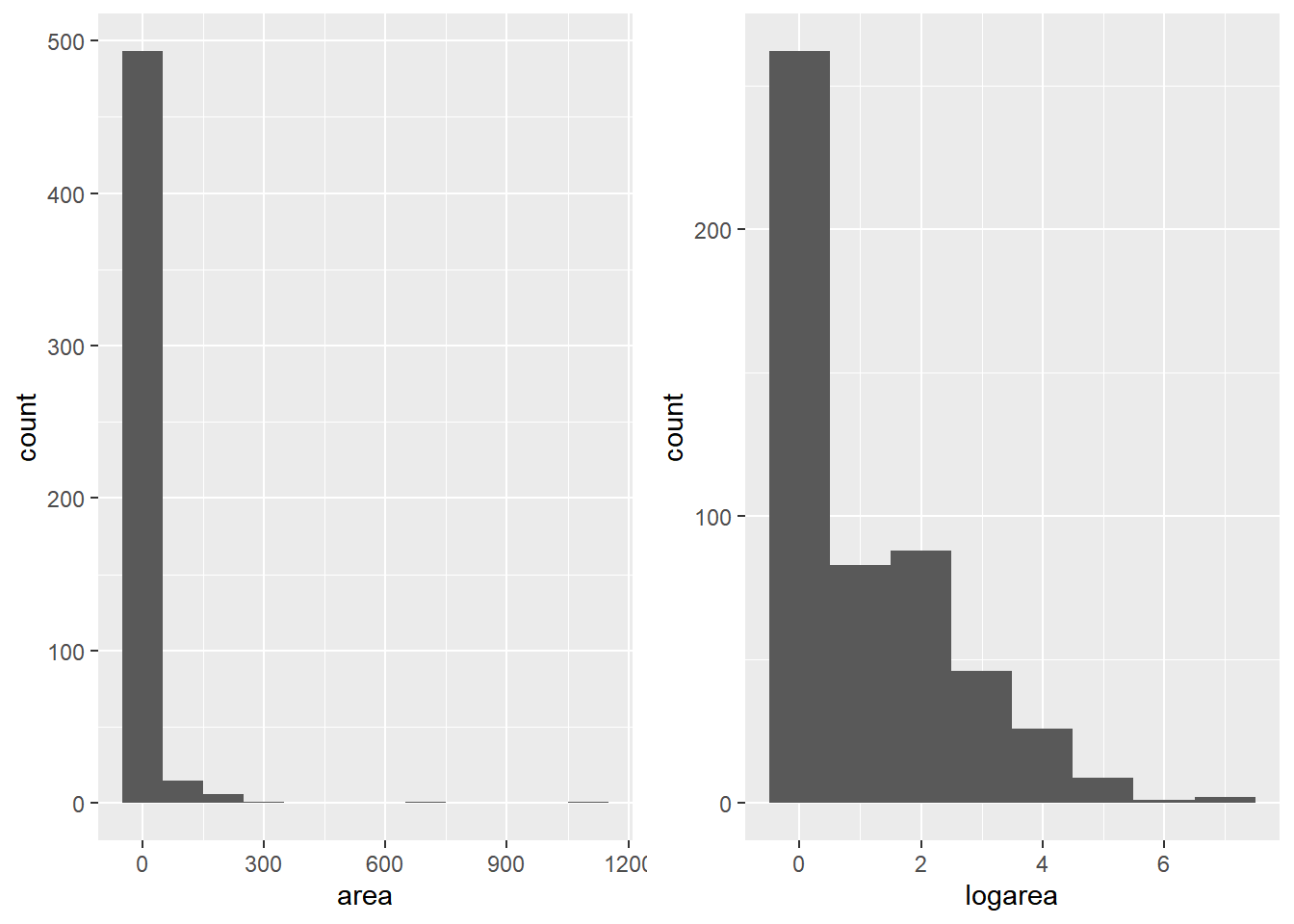
Remember the histogram from earlier? The skew in the data can be a massive issue for further analysis or ML model application. To amplify the difference in the data, we’ll spread them out by taking the log. The 2nd histogram demonstrates the new distribution. Notice we added 1 to area, since you can’t take the log of 0.
ap1 <- ggplot(t, aes(x = area)) + geom_histogram(binwidth = 100)
t$logarea <- log(t$area + 1)
ap2 <- ggplot(t, aes(x = logarea)) + geom_histogram(binwidth = 1)
grid.arrange(ap1, ap2, nrow = 1)
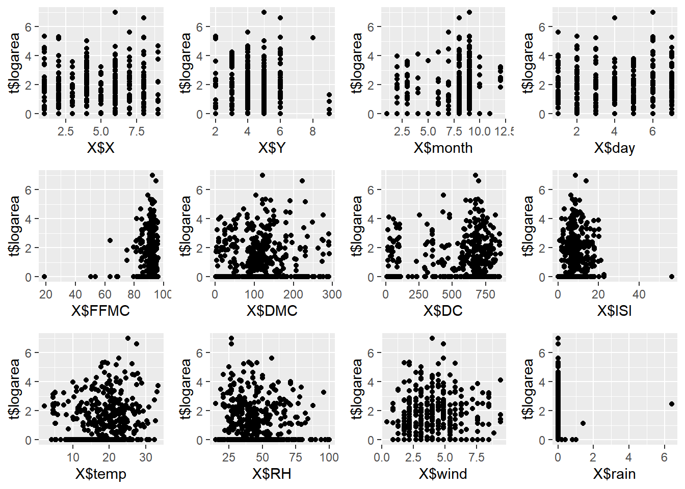
We’ll the plot create the scatter plots again to gain a better understanding of the correlation between variables.
p1 <- qplot(x = X$X, y =  t$logarea, geom = "point")
p2 <- qplot(x = X$Y, y =  t$logarea, geom = "point")
p3 <- qplot(x = X$month, y =  t$logarea, geom = "point")
p4 <- qplot(x = X$day, y =  t$logarea, geom = "point")
p5 <- qplot(x = X$FFMC, y =  t$logarea, geom = "point")
p6 <- qplot(x = X$DMC,  y =  t$logarea, geom = "point")
p7 <- qplot(x = X$DC, y =  t$logarea, geom = "point")
p8 <- qplot(x = X$ISI, y =  t$logarea, geom = "point")
p9 <- qplot(x = X$temp, y =  t$logarea, geom = "point")
p10 <- qplot(x = X$RH, y =  t$logarea, geom = "point")
p11 <- qplot(x = X$wind, y =  t$logarea, geom = "point")
p12 <- qplot(x = X$rain, y =  t$logarea, geom = "point")

grid.arrange(p1, p2, p3, p4, p5, p6, p7, p8, p9, p10, p11, p12, nrow=3, ncol=4)
Practice Using the Auto MPG dataset
Here we’ll be performing some of the same operations done above. Afterwards, to emulate Streamlit’s ability to build interactive tools / dashboards, we’ll create our first R Shiny app! (My first at least).
columns <- c('mpg', 'cylinders', 'displacement', 'horsepower', 'weight',
             'acceleration', 'model year', 'origin', 'car name')
auto_mpg <- read_table("auto-mpg.data-original",
    col_names = columns)
##
## -- Column specification --------------------------------------------------------
## cols(
##   mpg = col_double(),
##   cylinders = col_double(),
##   displacement = col_double(),
##   horsepower = col_double(),
##   weight = col_double(),
##   acceleration = col_double(),
##   `model year` = col_double(),
##   origin = col_double(),
##   `car name` = col_character()
## )
head(auto_mpg)
## # A tibble: 6 x 9
##     mpg cylinders displacement horsepower weight acceleration `model year`
##   <dbl>     <dbl>        <dbl>      <dbl>  <dbl>        <dbl>        <dbl>
## 1    18         8          307        130   3504         12             70
## 2    15         8          350        165   3693         11.5           70
## 3    18         8          318        150   3436         11             70
## 4    16         8          304        150   3433         12             70
## 5    17         8          302        140   3449         10.5           70
## 6    15         8          429        198   4341         10             70
## # ... with 2 more variables: origin <dbl>, `car name` <chr>
length(which(is.na(auto_mpg)))
## [1] 14
auto_mpg <- drop_na(auto_mpg)
dim(auto_mpg)
## [1] 392 9
length(which(is.na(auto_mpg)))
## [1] 0
In the following app, we’ll used sliders and selection tools to filter data for description and visualization. The code to create it is below with a few comments to serve as guidance!
In addition, here’s very helpful R Shiny’s documentation for how to deploy an app to the web along with a blog post for how to embed your Shiny apps into a blogdown site. Just load packages that you need within the app before you deploy it!
# Define UI for application.
ui <- fluidPage(

    # Application title
    titlePanel("Forest Fires Data"),

    # Sidebar with a slider and select inputs.
    sidebarLayout(
        sidebarPanel(
            helpText('Forest fire Data Filtered by Burned Area.'),
            selectInput(
        "sum", "Show / Hide Data Summary",
        c(Show = "show",
          "Hide" = "notshow")),
            sliderInput("range",
                        "Choose a minimum and maximum area:",
                        min = min(ff_data_num$area),
                        max = max(ff_data_num$area),
                        value = c(0,30), sep = '')
        ),

        # Show table outputs and plot output
        mainPanel(
           shiny::verbatimTextOutput('temp'),
      conditionalPanel(
        condition = "input.sum == 'show'",
        tableOutput('Summary')),
        tableOutput("DataTable"),
        plotOutput("Plots")
      ) ) )

#

# Define server logic required to create desired outputs
server <- function(input, output, session) {

    output$Summary <- renderTable({
        sumdt <- as.data.frame(do.call(cbind, lapply(ff_data_num, summary)))
        sumdt[4,] <- round(sumdt[4,], digits = 4)
        sumdt <- sumdt%>%
  add_column('Metric' = c('Min', 'Q1', 'Median', 'Mean', 'Q3', 'Max')) %>%
          mutate
sumdt[,c(14,1:13)] })

    output$DataTable <- renderTable({
        dt <- ff_data_num[ff_data_num$area >= input$range[1] & ff_data_num$area <= input$range[2],]
        dt })

    output$Plots <- renderPlot({
      dt <- ff_data_num[ff_data_num$area >= input$range[1] & ff_data_num$area <= input$range[2],]
      plot1 <- ggplot(data = dt) +
        geom_point(aes(X, Y))
      plot2 <- ggplot(data = dt) +
        geom_histogram(aes(area))
      plot3 <- ggplot(data = dt) +
        geom_point(aes(temp, area))
      plot4 <- ggplot(data = dt) +
        geom_point(aes(wind, area))
      grid.arrange(plot1, plot2, plot3, plot4, nrow = 2, ncol = 2,
                   top = textGrob(paste("The number of filtered data samples:", dim(dt)[1])))
    }) }

# Run the application
shinyApp(ui = ui, server = server)